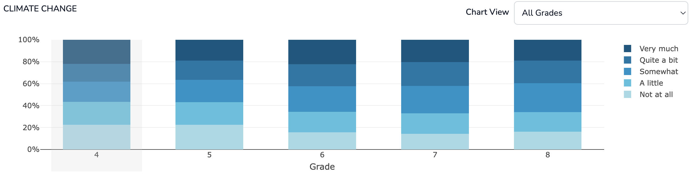
The Middle Years Development Instrument (MDI) provides insights into children's social and emotional health, well-being, and assets during middle childhood—from their own perspective.
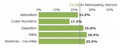
First implemented by the Human Early Learning Partnership (HELP) in British Columbia (BC) in 2009, more than 75% of public school districts have now participated in the MDI (see map to the right).
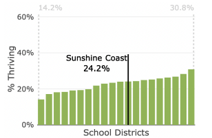
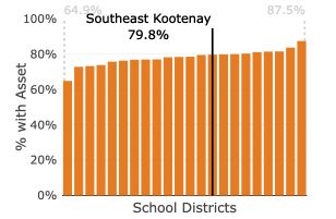
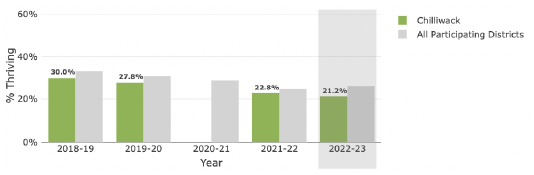
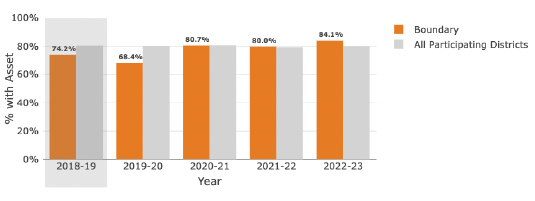
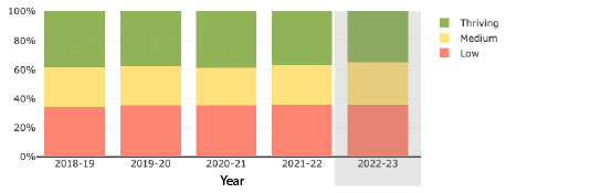
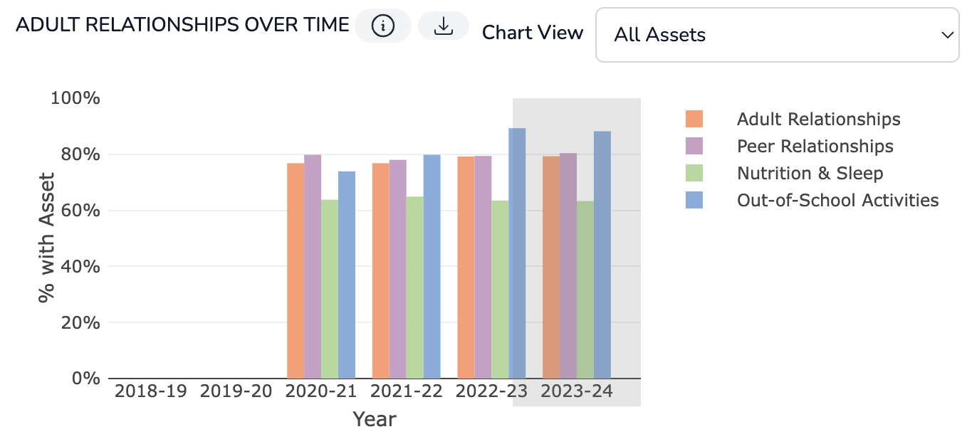
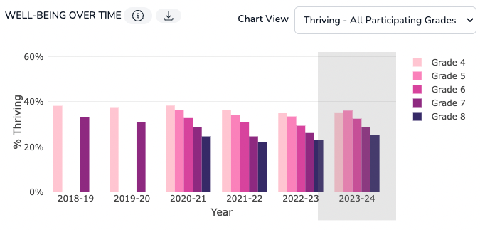
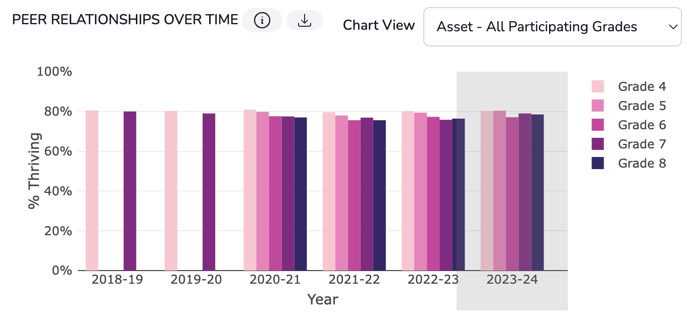
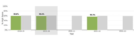
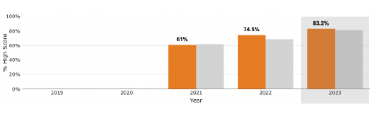
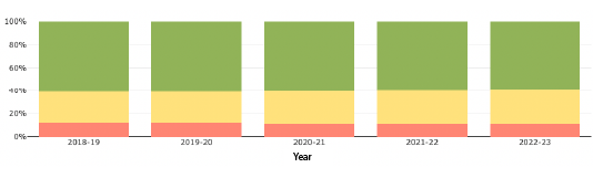
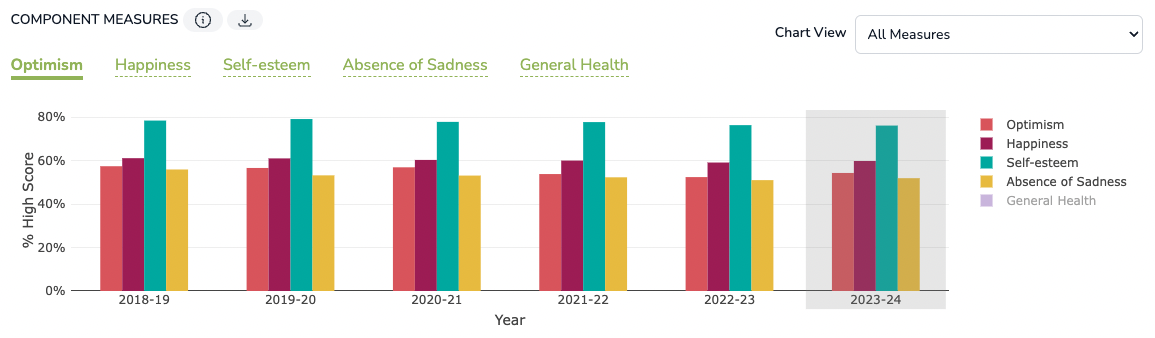
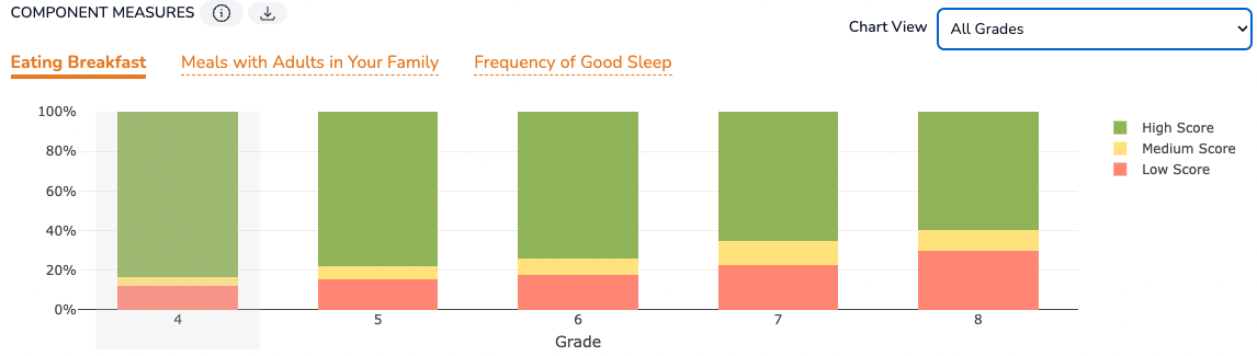
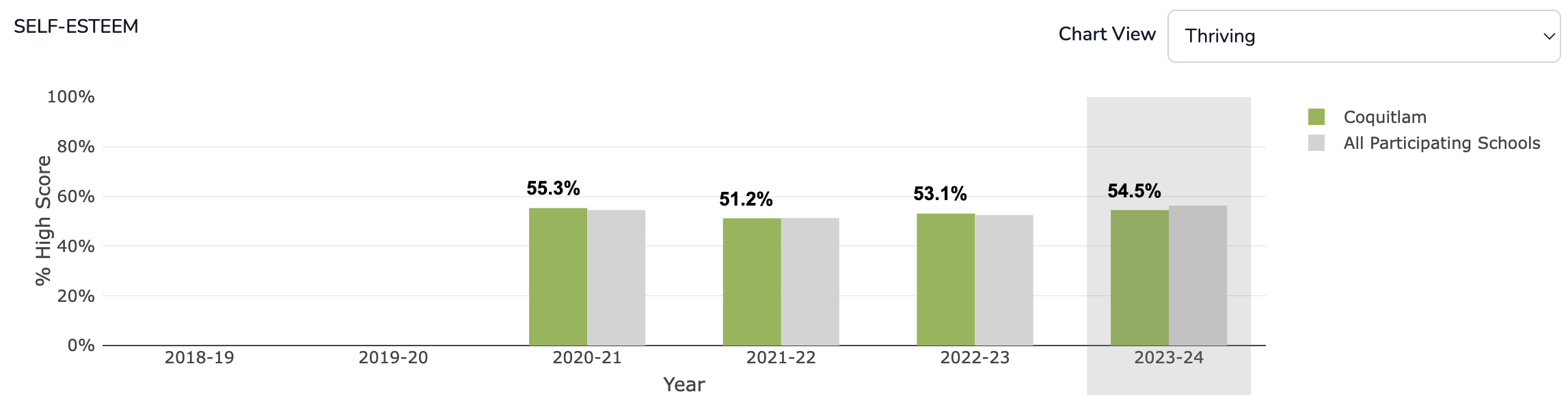
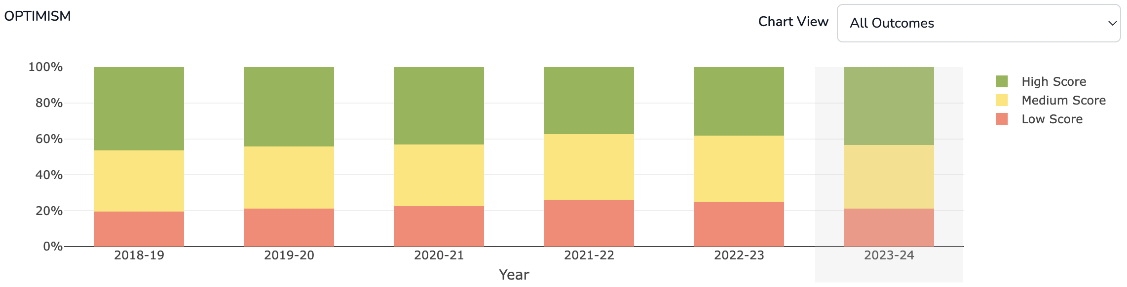
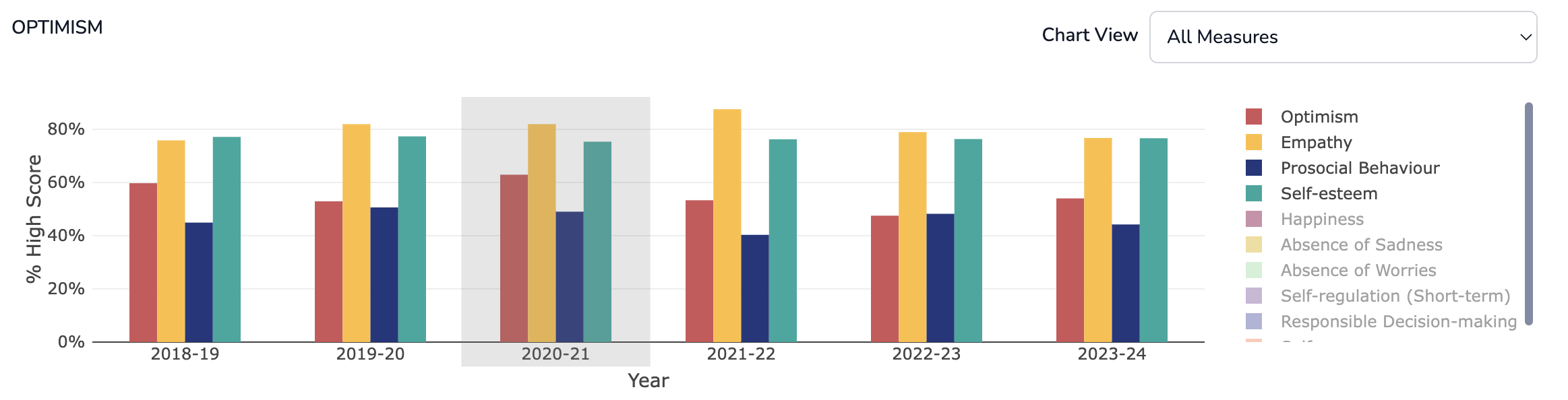
The MDI Data Dashboard is an online, interactive tool for exploring trends in MDI data from 2018/2019 school year to present. The MDI data available through the Dashboard are reported based on children’s home postal codes and include children who completed the MDI in a participating school district or independent school and who live within the boundary type selected.
For a guided walkthrough on getting started using the MDI Dashboard, watch this video:
For a breakdown of the MDI dimensions, measures, and items reported on the dashboard, view:
For an overview of the MDI as well as detailed information of how to interpret MDI data on the Dashboard, view:

Click the "Explained" information icon found throughout the dashboard for more information on modules, data, charts, and tables.
Click the "Download" icon to download individual charts or an entire module as a .PNG for use in presentations and reports.